
CSS grid layout is a game-changer for crafting modern web page alignments. With just a few quick lines of CSS, you can build robust layout foundations to style complex sites faster.
I wanted to share a simple example of using CSS grid for an overall page structure:
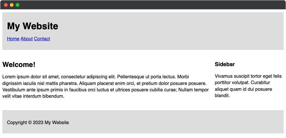
As you can see this includes:
- A full-width header
- Main content area
- Sidebar section
- Full-width footer
To start I defined the grid container:
.container {
  display: grid;
  grid-template-rows: 80px 1fr 80px;
  grid-template-columns: 1fr 3fr;
  gap: 20px;
}
This sets up two columns, 3 rows, and space between. No fiddly width values needed!
Next I can make the header and footer extend the full width:
header,
footer {
  grid-column: 1 / span 2;
  background: #ddd;
}
Using span makes them automatically stretch without another class. Clean!
Inside I have:
<header>
  <!-- Header content -->
</header>

<main>
  <!-- Main content -->
</main>

<aside>
  <!-- Sidebar content -->
</aside>

<footer>
  <!-- Footer content -->
</footer>
And there you have it! Grid handles the structural alignment so you can focus on styling. I love how much faster development is compared to floats or tables.
Let me know if this helps explain some CSS grid basics! What layouts would you want to build with grid?

